Thursday, June 30, 2016

35 Cards in 4 Days...

I never create cards in a race against the clock...
I create at a pace that allows me to enjoy what I am doing...

So 2 weeks ago...
when my friend John asked me to create 35 cards for him...
I knew 
(and he knew)
that I would "get to them"...
when I had time.

Well...
I finally had time these last 4 days to dedicate all of my card making time to John's cards.

He asked for 5 each...of 7 different cards
(all of which I have made in the past)
and...
the best thing is...
each card was one that I truly enjoyed making.

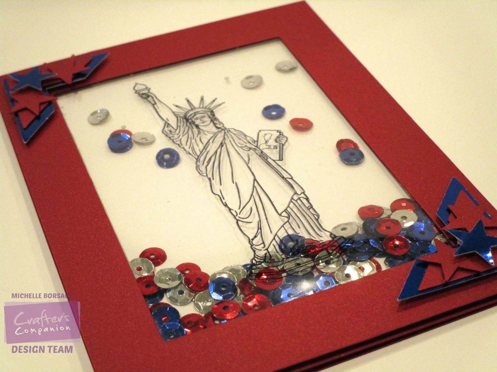
I've got lots of photos to share...
The pics are not my usual nice little photo-shoot photos...
They're actually the unplanned...spur of the moment photos that I took today...
with my phone...
and was sending to John throughout the afternoon....
 as each set of 5 cards was completed...
This means that the lighting and "card posing" is far from great...
(sorry)
My Cutterpillar was a prop...
and there's lots of clutter on the worktable

Still..
I'm happy to share some photos with you...

Many of you had asked me ( on Facebook) what I used when coloring/painting...
and also which stamps I had used...
so...
I'll include that info below

Okay..
here we go...

First up...
The Hummingbird card
(Stampendous stamp and Spectrum Noir AquaBlend pencils)
I used Crafter's Companion Water Colour Card Stock for all of the water colored cards


and..
The Horse card...
Our Daily Bread stamp and again, AquaBlend Pencils


A stamp single from Altenew
a great quote from Altenew...
and some coloring with Spectrum Noir Alcohol markers
(Spectrum Noir Ultra Smooth card stock)


A Topiary Piano image by Michelle Masters
from Art Gone Wild
Water colored with the AquaBlend pencils.
(I have a little collection of her topiary designs...and can't wait to ink up the others)


The Boathouse
from Crafter's Companion...
water colored with the AquaBlend pencils

I stamped, colored and cut out the sailboat 
and placed it on the card with foam dimensionals


and ...
I kinda saved the best 
(and my faves)...
for last.
Holy schmoly
Look at those gorgeous Catherine Scanlon images!
I could spend all day creating cards with these 2 images...
All 10 of these were colored with a combination of Altenew Crisp Inks...
and Tim Holtz Distress inks
Both the Altenew ink...and the Distress ink are amazing for water coloring...


I Love Love Love this image...
and the way that this image invites and brings opportunity to be bold and daring with color...

So now..
If the bouquet image above had me saying that I
Love Love Love ...
then this Chrysanthemum image 
gets LOVE x's 10,000
I am cuckoo over the top crazy about this gorgeous image.
Seriously cuckoo.
So..now...
because I am wackadoodle cuckoo for the chrysanthemum image...
and these cards...
YOU get to see individual photos of each one...
(and then some)

Ready?
(I am squealing with glee over here...)

<sigh>
I am in Love

John has asked me...in the past....
to create coral colored florals...
so I made a few chrysanthemums in  coral tones...
thinking he'd be really happy with the colors.


  and this one...
coraly-pink


This coral chrysanthemums leans towards a orangey-rose tone...


I love all of the chrysanthemums that I've shown you so far....
but I must confess...
I kinda sorta (definitely) have a favorite.
I know...
we card makers are NOT supposed to choose a favorite..
(it's as taboo as having a favorite child...
when in fact you have multiple children)
but...
I have a favorite...
and it's THIS ONE!
I should add...
When I sent this photo as a text to john...
I added a comment saying...
Send this card to me next March for my birthday
I didn't ask.
I told him.
Bold..perhaps...
but the truth is...
this card is only on loan to John...
until he sends it to me next March.
He didn't know that...
but now he does!


I contemplated addressing the envelope to myself
I wrestled with my prankster prone self to NOT do it
(hahaha...oh how I DO get a charge out of my cuckcoo-nutty -self)

and just as I was getting ready to call it a day which photo-shoot...
the sun came streaming in through the studio window ...
creating a spotlight 
and shadowy cross hairs on the worktable..
illuminating the gold embossing on each card 
and making me pause..
to stare at these glistening images.....
and...
to take one last photo.


I've already got my next Catherine Scanlon stamp ready to roll...
It's positioned...
in my MISTI...
waiting to be stamped out...embossed...
and water colored...
tomorrow...
when a few friends are coming over to share a day of scrapping and card making ....
in the studio.

Thanks for visiting...
I hope that somewhere in the photos above...
that you found a little bit of inspiration!
Michelle.


Wednesday, June 29, 2016

Lady Liberty Shaker Card


HI everyone!
It's Wednesday...
and that means that it's my Crafter's Companion Design Team Project Day, here at my blog.

I've got something "seasonal" to share today...
along with a little story about me...
and where I grew up..
and continue to live.

I'm an "Island" girl...
Not Hawaii
or the tropics...
I'm a Staten Island Girl...
I grew up on a little Island that is part of NYC...
a small little island...14 miles in length from one end to the other...
Then..in my married life..
I hopped across the water to Long Island...
but never venturing too far away from the place that I will always call home...
Staten Island.


The Statue of Liberty is a significant to us, as Americans.
and...for me...
it holds a little bit of extra significance...
being that Lady Liberty has always been right in my backyard.

Growing up on Staten Island, and continuing to live, now
not far from Staten Island...and Manhattan..
The Statue of Liberty is part of the backdrop of so much of daily life.
But, this being said...
my sense of awe...or appreciation for sharing my backyard with this "Lady" has never diminished.

A ride on the (Staten Island) Ferry is a 25 minute visual experience that never gets old...
even if you've done it countless times...as I have.
An experience that I've never taken for granted...
Standing on the ferry and looking back at the sandy shores and hilly green landscape of my childhood Island reminds me of what "home" truly means...
no matter how far I may roam.
(and yes...that little Island...just a stones throw away from Manhattan..
is the place that has given me my (very) pronounced...
and VERY OBVIOUS 
New Yawk accent.

Looking out over the water as the ferry glides across its surface...
seeing the bridges....
Verrazano...Brooklyn...Manhattan...
The unmistakable skyline of the city...
Governors Island...Battery Park's greenery...
the Brooklyn Waterfront...
Ellis Island..
I could go on and on...
There really are no words to describe all of it...
or...
any of it...
What I do know is...
I am one lucky girl to have all of this...
in my backyard...
(literally)

Being a Staten Islander...
salty sea air...beaches...the shape of the skyline of lower Manhattan and beyond...
and the Statue of Liberty
are what surrounded me each day...
as I worked...ran errands...and lived my Staten Island life.
Even now...
when we go to a minor league baseball game on the Island...
the stadium touches and sits on the waterfront...
and while we sit in our seats...
the magnificent skyline of "the city"...
and the Statue of Liberty are just behind the outfield.

So as Independence Day is drawing near...
I wanted to create a card that included Lady Liberty...

Crafter's Companion Destinations~Spirit of Adventure stamp set 
has a beautiful Statue of Liberty image..
(and it's the perfect size for card making)
and so...
That's the stamp that I used as the centerpiece of this CAS (Clean And Simple) card.

I stamped the image onto a transparency sheet 
(made sure to let it dry)
and created a patriotic inspired shaker card using red white and blue card stock.
I cut some photo corners and stars...
added some red, blue and silver sequins...
and...
here it is...
A very patriotic Statue of Liberty shaker card...
shimmery...and sparkly...
and very red, white, blue....and silver! 
Clean And Simple...
and ready for the 4th of July!


The shimmery red card stock is perfect for this card..
(afterall...what's 4 of July without some sparkle?)
I added some die cut stars...
I had a small piece of blue foil in my scrap folder..
and added that for some extra color and shine
You can see the corner elements and dimension in this close-up.


This card is very much...me....
it's very much my preferred style of card making..
Crisp...clean..and simple...
and was fun to create.
(I haven't made a shaker card in a while!)
and...
this wonderful image makes me smile...
and reminds me of home...
It doesn't get much better than that.


Thanks for visiting....
I hope that this CAS card inspires you to create a shaker card of your own...
Michelle.

Supply List:
Misc: Transparency sheet, Black Ink pad, sequins, foam mounting tape, trimmer, scissors

Sunday, June 26, 2016

Color Splashing a Stamped Image

I love black and white photos that have been color splashed..
so it makes sense that I enjoy color splashing some of my stamped images.
I've been color plashing images for what seems like forever...
I actually go on color splashing binges...
Color splashing is kinda like a potato chip...
You can't just "have" one...

This simple, yet lovely image seemed perfect for a little color splashing...
Although I am crazy about water coloring...
this time..
I chose to add color with my Spectrum Noir Alcohol markers...
mainly because I wanted rich, solid color.

I chose two focal elements intros image to highlight with color...
The starfish on the arm of the Adirondack chair..
and the hat.

Color splashing is perfect for me...
the me who is a die hard CAS card maker.
Whenever I color splash an image...
I always feel like it's so crisp and clean looking...
and this makes me one very happy card-making-girl!
(very happy....as in giddy with happiness)

I created two cards ...
both are color splashed...
(the hat and starfish)
two different colors...
(red and blue)
One image was cropped down to eliminate the "frame " lines that are part of the stamped image.
The other was not..
So.....one image is a bit different than the other.

Here ya go....
Color splash #1...
with the framed edge


I love the crispness of the red against the brown tone ink
and kraft card stock background...
By the way....
the jellyfish has a little shimmer to it...
(thank you Wink of Stella!)


and..
this is version 2...
cropped a bit...
(no framed edge)


So...
What do you think?
Red?
Blue?
Framed edge?
Or not?
And one final question....
Are you now a fan of color splashing...like I am?
*The true sign of being a fan is if you now plan on hurrying off to your craft space...
so that you can go through all of your stamps...
and start thinking of which need to be splashed!


I hope that you've been inspired to give color splashing a try!
Have a great day...
and thanks for visiting!
Michelle

Supplies: 
Stamp: Impression Obsession (#H1976)
Coloring: Spectrum Noir Alcohol Markers
Card stock: PTI, LCI
Misc: Wink of Stella ~ Clear, Ranger Archival Ink

Friday, June 24, 2016

"Beautiful Bouquet"

I was so excited to get this stamp set
and was happy to finally find some time to ink it up.

There are a few different Ranunculus stamps out there right now...
but this one...
by WPlus9 caught my eye because I like the size and grouping of flowers..
and the presence of leaves and flower buds...

I stamped the image out with Versamark Ink
onto Crafter's Companion Spectrum Aqua Water Color Card Stock
and heat embossed it with Sparkle N Sprinkle Fine Detail Gold Embossing Powder.
The image was colored with ZIG Clean Color Real Brush Pens.


This image has so many nice little details....
and they all come together to create a "Beautiful Bouquet"
The image seemed ideal for water coloring 
and also seems perfect as a stand alone focal image...
so I chose to create a simple, clean frame
(using  LCI Violette Metallic card stock)
The image is perfect for my preferred style of card making....
CAS...Clean And Simple
If you've been thinking of adding a Ranunculus image to your stamp collection....
This one, from WPlus9, is fantastic, I think.

Thanks for visiting!
Wishing you a wonderful day!
Michelle


Thursday, June 23, 2016

A Sketchy Dilemma.....But I have a Plan B

Dilemma!
Dilemma!

I've got a dilemma.

I ordered this sketch style stamp...
and a nice amount of other sketch style stamps.

I like them...
and
I look(ed) forward to using them.

I chose this image (the swan/lily pad/frog)
from the collection of sketch stamps that I have ...
and decided to make it the first one that I would try.

The plan was to use my Spectrum Noir AquaBlend Pencils to water color the image.

I stamped out the image
and that's when the trouble began!
and..
That's when I learned something.

and...
that new tid bit of knowledge is....
Sketch style images (might) tend to look blurry and sloppy when stamped onto water color card stock...
(which is usually not smooth)

and...
that does not sit right with me...
the Felix Unger of the card making world....(aka...me)
Me...the person who has a deep and genuine  love of creating ultra clean & very crisp looking cards.

But...
I figured...
it was stamped out...
so...I gave it a try.

*By the way....I should note...
I have not given up on the sketch style stamps that I have...
I have a PLAN B!
I am going to stamp this image out again...
on ultra smooth card stock...
and see how it looks.
(less sloppy and blurry I hope)
and then...
I'll color it with Spectrum Noir Alcohol markers...
or something...
maybe bendable pencils(?)
I'm not sure...
(Wish me luck!)

Anyway...
here's the image..
on water color card stock...
colored with Spectrum Noir AquaBlend Pencils

I do have to say...
as I began to add color...
the blurry detail (frog..flower...lily pad) seemed to become a bit more defined.
Still...
for me...
it's too messy looking.

So here ya go...
what do you think?
(I'm NOT pleased with the speckled frog...at all)


See?
Do you see what I'm talking about?
The areas of the stamp that have sketch shading are too muddy looking..
not crisp
not clear
and...above all....
not me.
(on a positive note..the flower petal tips are highlighted with clear Wink of Stella..
and that looks nice (in person...even though it doesn't show well in the photos)
But oh...that frog!
He needs help.
Big time.


So keep your fingers crossed for me...
and wish me luck...
I'm going to forego water coloring the sketch style stamps...
and try something else.
That's a shame, though...
because I've got some beautiful sketchy light houses that would have been nice to water color.
Oh well.

I'd love to hear your thoughts on this "dilemma"
so please feel free to comment below.
Thanks for visiting...
and have a great day!
Michelle


Card making friends...Supply info is simple....most of which has been noted above...
The stamp is by Impression Obsession....card stock (solids) are LCI and PTI....print is DCWV

Wednesday, June 22, 2016

It's Wednesday!...Time for some Crafter's Companion Loveliness!

It's Wednesday!
and...
that means that it's Crafter's Companion Day here at my blog!

This week I've got a a card to share that is created primarily with paper...
(very little stamping...no coloring....etc)

Crafter's Companion Butterfly Lullaby 12 x 12 paper pad is filled from front to back with beautiful paper...
so many pretty prints... 
and the soft colors are beautiful as well.

One of the pages, in particular, caught my eye...
and I just knew that I "needed" to create a card with it.

*I should note: In the past...the thought of putting a scissor to a beautiful sheet of printed paper would have made my knees tremble...
but...that's the old Michelle..
The new daring and bold Michelle looks at a print...
and sees opportunities to create in different ways!
No more anxiety about using parts and bits and pieces of a 12 x 12 sheet of paper!

And so...that's exactly what I did...
I created a card from parts of (2) 12 x 12 sheets of Butterfly Lullaby prints!


I've got lots of tidbits of information to share with you about this card!
(In case you'd like create one exactly like this...or one that's similar)

The base card is a Die Cut Card Blank!
(already cut an scored...and ready to roll!)
The floral pieces of paper are cuts from the same 12 x 12 sheet of paper.
(The roses on the right were cut individually and layered together)
Even the butterflies came from the same sheet of paper!
The dotted background was cut from another beautiful 12 x 12 sheet of paper
(from the same Butterfly Lullaby paper pad)
The (awesome) small wood frame is from the Downton Abbey Collection.
The sentiment is one of the many stamps in the Sara Signature Collection: Hello Beautiful stamp set.

How about a few close-ups?
....so that you can see the details.

You can see the beautiful lavender colored wood frame here....
(all of the frames in the set are really pretty)
The frame is a nice weight/thickness...
so when I placed the sentiment & print behind it..it has lots of dimension.
This photo also shows the layered roses on the right...each cut out separately...
and then placed in the corner, so that they would peek out form behind the frame.
The butterfly perched at the corner of the frame also adds some nice dimension.
The soft colors of the smaller flowers on the right...and the small white flower in the frame...
were the perfect places to add a few small rhinestones.
The matting behind the print on the left is White Shimmer Card Stock.
Oh!...I wanted to tell you that when choosing the portion of the 12 x12 paper for the sentiment and frame...I slid the frame around on the paper,
until it was on an area of the print that I thought would look best with a stayed sentiment over it...
When the frame landed over these little flowers...and the roses on the bottom...
I knew that was the portion of the paper that was ideal!


When the card is opened...the frame appears to be floating over the right panel....
(because...it is!)
Here's the layered roses again..
and the smaller of the 2 butterflies...in the lower right...
The butterfly is popped up a bit...attached with a foam dimensional.


And....
a side view of the card
See how the wood frame floats?
That's because only the left-most inch of the back of the frame is attached to the card
(I used Red Liner Tape...so the frame would be sure to stay in place)
I love that this card is already cut and scored...
and ready to go...right out of the package!


And here's the card...folded-down....
....and there's that "floating" frame again! 


I'm happy to share this card with you today....
and especially hope that you'll look at beautiful 12 x 12 prints, like Butterfly Lullaby...
in a new and different way...
In a way that brings you fresh....creative ways of thinking..

Thanks for visiting...
Wishing you a wonderful...and creative day!
Michelle.

PS...
I love it when you share comments (below)
So how about telling me what you think about this Butterfly Lullaby inspired card!


Supplies:


Accessories/Embellishments: Downton Abbey - Wooden Frames, Self Adhesive Rhinestones

Misc: Red Liner Tape Mega Roll (3mm x14m) 1/8" wide x 15 yards, adhesive runner, trimmer, scissors, foam dimensionals


Tuesday, June 21, 2016

Beautiful Lady....Take 2

 Yesterday I shared a card created with Altenew's Beautiful Lady stamp set....
and I mentioned that I had a second Beautiful Lady image water colored...and drying...
waiting to become card!
Well....
the image dried..
and a card was created!
and...
I used a print ...again!!
WOW!
Me!
Using a print again?
That's one for the card making history books!

I enjoyed water coloring this beautiful floral image...
it's got lots of nice details...
and seems perfect for gold heat embossing...
and water coloring.
Yesterday's card had a sentiment banner on the front of the card...
This time...
I opted for some fine gold thread
because the background print has lines of gold in the print pattern.


The sun was streaming through the studio windows...and almost illuminated this card as I was taking photos...
You can see the details really well in in the pic below
(embossing...thread...flower details etc)
*Note: Altenew Crisp Ink Pads were used for all of the water coloring.


Altenew's Beautiful Lady stamp set is definitely one that I will use over and over again.
I hope that the cards I've shared these last 2 days have inspired my card making fiefdoms to get out some water coloring supplies...a heat gun... and embossing powder...
to create a water colored card of your own!

Thanks for visiting...
and have a wonderful day!

Card loving friends....This card is now available for purchase, at The Bellissima Card Shop

Card making friends ....Key supply items have been noted in the blog post above....(primarily the stamp set....and ink)
Embossing powder is Sparkle N Sprinkle Fine Detail Gold EP.....Water Color Card Stock is from Crafter's Companion...

Monday, June 20, 2016

Beautiful Lady....Beautiful Quotes

It' always fun to go through a stack of new stamps....
looking at each one..
and having that moment when one set calls out to you...
and sparks some creativity...
some ideas...
and brings a vision of a card that you'd like to create.

It's also  always fun to ink up some new stamps for the very first time.

This time...
My fun came via Altenew's Beautiful Lady and Beautiful Quotes stamp sets...

I haven't water colored in a few weeks...
and Beautiful Lady shouted "WATER COLOR" to me.

So that's what I did!
 I inked up Beautiful lady....
Got out some ink pads....my paint brushes...
and all of the other things needed to water color a stamped image.
I heat embossed the image with Fine Detail Gold Embossing Powder...
and then...picked up my paint brushes!
It felt SO good to water color an image!
A few weeks of no water coloring is a few weeks too long for me!


When the image was dry...
I matted it with LCI Metallic card stock...
Then...
I looked through some prints....in search of a good match.
(I found one!)
I should note...I don't use prints often...
I own TONS of gorgeous print paper...
yet rarely use prints...
So this time...I decided to use a print
After the card was assembled...
I created the sentiment banner...
using a great quote from the Beautiful Quotes stamp set
(LOVE that stamp set!...every quote in the set is fantastic!)
(By the way....re the banner....no die needed...banners like this one are a cinch to make)

Now let's sum this all up by saying....
Beautiful Lady + Beautiful Quotes = Beautiful Card
The math checks out!
BL+BQ=BC


I also have a pink version of this image water colored....
and drying as we speak....
I'm looking forward to creating a card with it tomorrow...
and will share it here as well.

Thanks for vistiing...
Wishing you a wonderful day....
Michelle.

Card loving friends...this card is now available at the The Bellissima Card Shop

Card making friends....Key supply items have been noted in the blog post above. 

Wednesday, June 15, 2016

Floral Delight

Beautiful paper has always been my weakness...
I love it...I search for it...I hoard it...
and yes...
although I hoard it....
I actually use it!

Floral Delight
(Crafter's Companion/Sara Signature Collection)
spoke to my paper-loving-weakness..
It is absolutely beautiful!
The colors...the prints...the florals...
they're all so beautiful.

I loved flipping through the paper pads...
after a few flips...and re-flips...
I chose the print pages (dots and stripes) and the floral page that I wanted to create a card with 
from the 12x12 and the 6x6 Floral Delight paper pads.

I knew that I wanted to use the Ornate Trellis die in my card design
and the Nouveau Stamping Frame Die
(also from the Sara Signature Floral Delight Collection.)
I chose a sentiment from the Hello Beautiful Stamp Set  (Love & Romance Collection)
and.... a sheet of 6x6 that I had my eye on for making a sentiment banner

Once I had all of my materials and supplies together...and prepped...
I got buy making a card!

I used half of the Ornate Trellis die...

I wanted to create a frame, using the dotted print paper
so....I cut the paper to size (4 x 5 1/4) 
and used the rectangle die from the Nouveau Stamping Frame Die set to cut out the center of the print

I also hand cut the flowers and leaves 
from the 12 x 12 sheet of paper that I had chosen from the paper pad.
And....
 I created a banner for the sentiment with a strip of paper from the 6x6  Floral Delight paper pad.
(The sentiment is one of the stamps in the "Hello Beautiful" stamp set.


You can see all of the beautiful dimension here...
The flowers...the banner...and the dotted frame
are all popped up off of the card.


You can really see the dimension here...
I just love that floral piece ...
the colors are so pretty...and go nicely what the kraft color of the prints
And...
the best thing is...
that big beautiful 12 x 12 Floral Delight paper pad and companion 6x6 pad  
both have lots and lots and lots of...(more) beautiful paper 
that I can create more cards with...
some like this one...and others with new and different designs!
Each and every print and pattern is beautiful...
so the possibilities are almost endless!

I hope that you've enjoyed seeing this gorgeous paper...
as much as I enjoy creating this card with it!

Wishing you a wonderful...and creative day!
Michelle.


Supply List:

                              Spectrum Noir Ultra Smooth Premium White Cardstock Unscored 8.5" x 11"
                              Shimmering Cardstock 6" x 6" 20pc package - Pearl White


Misc: trimmer...fine detail scissors...foam dimensionals...die cutting machine..ink pad

Monday, June 13, 2016

CCAS Cards....Part 2

I've got a CCAS Cards Part 2 to share with you today.
Remember, in my last blog post...
I decided to create my own descriptive word for the featured cards....
(I took CAS a step further...)
and I described the cards as being....
CCAS
Crisp Clean And Simple.

I also mentioned that I had colored a few of a second flower design 
from the same Penny Black Efflorescence stamp set...
and would share them here after I created a few cards with them....

So....today..
I'm back with the second set of CCAS cards...

 it dent get more CCAS-y than this...
a crisp white background...
Clean bright colors
and..
a simple sketch (aka "layout")


The flowers were colored with Spectrum Noir (alcohol) Markers
and then cut out using the Scan N cut.
The ornate frame die is from Darice
The sentiment is from PTI...as is the white card stock
(green card stock is LCI)
The sentient was stamped with Versamark ink...
then heat embossed with Stampin Up embossing powder.
I used  foam dimensionals to pop up the frame...for added dimension.


The second card uses all of the same products and supplies...
but this time...
I placed the flowers in the lower right corner...


CCAS....
(makes me a happy-card-making-girl)


I had colored 3 flower images...
and so I created 3 cards...
I enjoyed using my Spectrum Noir markers...
This was the first time I used the frame die...
(although I've had it for a long time)
The Stampin Up embossing powder isn't a color that I use often...
but in this case...
The color was....ideal.

And..
there you have it...
3 cards that are perfect for my new (self created) favorite card making term....
CCAS
Crisp...Clean...And....Simple!


Have a great day...
and thanks for visiting!
Michelle

Card loving friends...the cards shard here today are available at The Bellissima Card Shop

Car making friends....Info re supplies and products used to create this card are noted in the blog post above