Pages

Saturday, July 29, 2017

Something Itty ...Something Bitty

I'm so excited about today's card sharing.
Yesterday... my crafty pal Debbie (M) joined me in the studio
for  day of card making...
We were in the studio doing nothing but card making from 11 am until after 8 pm...
We barely ate....forgot to hydrate ourselves...
and between us only 3 trips were made to the ladies room
(One trip of which was mine!)

We were in our happy place...our card making zone..
and nothing was going to interrupt it!

When Debbie arrived...she took out a stamp set that I instantly became smitten with.
She was so kind...and invited me to stamp out some  images 
to create some cards my own.

I took her up on the offer!

I stamped out 8 of the large image from 
Neat and Tangled Itty Bitty Welcoming Committee...
I got out my Copic and Markers....and started coloring.
When the images were colored....I cut them out with the Scan N Cut.
I chose some dotted Papertrey Ink in two different colors...
and...some solid colored card stock for matting....
I got out some fun foam and some foam dimensionals...
My Big Shot...and MFT's Mini Scalloped Rectangle Dies...
Clarity Stencil Brushes...
and a few ink pads.
and then...
 the card making began!

I created 8 cards total...
4 in colors that are ideal for welcoming a baby boy...
and 4 in colors that work well for a baby girl.

First....the boy-friendly version...
The bunny and the banner are both highlighted in a turquoise-like color...
I used fun foam to position the scalloped layer..
and foam dimensionals for the large image piece and the tiny little chick.
Adding dimension to this card was the way to go!
Can you see why I was immediately and totally  smitten with this stamp set?
I LOVE this stamp set!
(I MUST HAVE THIS STAMP SET)


The baby girl-friendly version is identical to the card above....
except for the color palette...and the addition of the tiny pink bow.
(I created blue bows for the card above...but opted not to use them...
to my eye....they just didn't seem to sit right on the bunny or lamb's neck...)

It as love at first sight for me and this stamp set...
and it was the same kind of love when I finished creating this stack of 8 cards!
I have a feeling that now..
after seeing these cards...
that YOU understand the "smitten"....and the "love at first sight" thing...  

As for me...
I am on my way NOW to order this wonderful stamp set.
Thank you Debbie M for you'd kindness in sharing this stamp with with me!

Have a great Saturday, my crafty and creative friends!
Michelle.

Friday, July 28, 2017

A Beautiful Crate of Flowers

Hello my crafty and creative friends!

I'm excited to share some cards with you today...
Each created with the Petals & Pallets stamps & dies
by Concord & 9th.

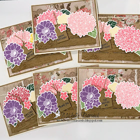
I've created 6 cards....similar...but different.
In addition to the Concord and 9th stamps and dies...
I used Stampin Up's Thoughtful Banners stamp set for all of the chosen sentiments.
The Kraft colored card stock (tag and crate) are by LCI
and the print is from a large 12 x 12 paper pad
All of the images were stamped with an assortment of Altenew Crisp Ink
The wood grain was stamped with Stampin Up's Crumb Cake Ink.
I used LOTS off foam and smaller foam dimensions to position the crate and each flower...
as well as the hand cut sentiment tag.

I started out by stamping and die cutting all of the flowers.
 Next..I die cut 6 crates from the kraft colored card stock.
Then...I Used my MISTI to add the wood grain to each crate with the Crumb Cake ink.
I prepared the matted print layers...and set them aside.

I didn't want the crate to lie flat on the card front
(as I've seen on most cards created with this die)
so I opted to score each end of each slat on each crate...and fold it under
to give some dimension to the crate.
I positioned the crate on the card front with foam dimensionals.
This is what the scored crate looked like prior to being placed on the card fronts.
I used Scor Tape for a secure "stick"
I placed foam dimensionals at each corner...and at the bottom center....
and also at the center of the crate.


Once the crate was in position and secure on each card front
I began building the flower groupings...
placing each flower in position with fun foam and/or dimensionals.
I placed the leaves where I wanted them to be using ATG adhesive.
Then added the stamped sentiment tags to each card


Here are the individual photos...of each card..with the assortment of sentiments
Some of the flower groupings vary slightly..with regard to the colors..

I inked the edge of each tag...and finished the tags with a little bit of linen thread  

I don't make friendship cards often....
so this card was designated to be a much needed friendship card.

 I created 3 birthday cards..
I seem to need birthday cards most often

 This group of cards required lots of stamping and die cutting ...
and lots of time create...to their completion.
In the end...I didn't mind that they required a lot of my creative time
because they were worth it
and..
Because the set of 6 cards was so enjoyable to create.

Thanks for visiting today..
Wishing you a fantastic Friday!
Michelle.


Thursday, July 27, 2017

Brown Magic

Hello my crafty and creative friends!

Today, I'm sharing a card created with a twist ...
Instead of creating a card with the Black magic technique of coloring...
I'm creating a "Brown magic" card
by using brown metallic card stock as the base for stamping and coloring the image.

I stamped the chosen images from
Penny Black's DAHLIAS stamp set
onto brown LCI metallic card stock with White Stampin Up Craft Ink.
The ink is thick...and takes quite a while to dry...
so I sped up the drying process with a heat gun.
After the ink was dry...I colored the stamped images with Faber Castell  Polychromos pencils
making sure to choose colors that would blend nicely together.
When the images were colored..
I chose metallic card stock colors that complemented the image... for matting.
I positioned the matted image layer with  large rectangular piece of fun foam for dimension and lift.

Somewhere along the way...
the colored images started taking on an Autumn look...
So I chose a Thanksgiving sentiment to finish this card.


This stamp set is a go-to stamp set for me...I've created cards with it countless times.
The images are a nice size for coloring....
They're great for both water coloring...and pencil coloring
and the images work well when stamped together in a grouping...
as I did today...
Or when used alone.

Now that I've given "Brown magic" a try...
I am wondering what other "Magic" colors I should consider trying....

Have a great day...
and thanks for visiting!
Michelle.


Wednesday, July 26, 2017

Brutus Monroe Botanical Background ....Day 4....Version 4

Well...
It's Day 4...and Version 4 of my Brutus Monroe Botanical Background card making!
I've color splashed the  BOTANICAL BACKGROUND image.
I've colored the image with Spectrum Noir (alcohol) markers...
And...I've colored the image with Polychromos Pencils.
and then...
It was time to heat emboss and water color the image.!

I am excited to share this card with you!
You know how I LOVE to heat emboss and water color!

Here's what I did:
I stamped the image with Versamark ink onto a piece of Spectrum Aqua Card Stock.
Next...I heat embossed it with Sparkle n Sprinkle Bronze Embossing Powder
Then..
I got out some Altenew ink pads..and a Stampin Up Turquoise ink pad..
my paint brushes..some tiles to lay the ink down on...and pick it up from
and an H2O misting bottle...
I also needed a large oval die...I chose a stitched oval die....
Some LCI metallic card stock...and print paper
(Both the print and metallic were chosen after the image was painted...
I chose a sentiment from Penny Black's Heartfelt (Thanks) stamp set.
When I had everything out on the studio worktable... got busy water coloring.


Heat embossing & water coloring 
are probably my favorite things to do when creating a card.
I TRULY enjoyed creating this card from start to finish.
I don't use bronze embossing powder often
and I'm glad that I chose it for this card.
Although, I have to note: Because the images very details...there's lots of embossing ...which sometimes doesn't translate to looking nice.
BUT...even tho I had some reservations abut the embossing on this image once it was done...
I wound up liking it (a lot) after the image was painted and die cut and made into a card.
(At first...I wasn't so sure, though)
You can see all of the embossed detail that I'm describing...in this photo


After the image was water colored..
I set the stitched ova die...offset...over the image
and die cut the shape that I wanted ...with one flat straight cut side.


Next.I stamped the sentiment and hand cut the banner and matted it.
 I began putting the card together...
and this is what I whipped up!

The bronze metallic card stock works well as the larger mat for this card
and I'm happy with the barn wood print and it's contrast to the mat...
as well as the way it coordinates with the water colored image.
I'm also happy with my choice to create the flat-sided-oval

A large oval shaped piece of fun foam adds nice dimension to this card


I have so enjoyed creating cards with this fabulous Botanical Background stamp.
The image is wonderful..
It has a bit of a vintage look...
and worked nicely with each of the "coloring" techniques that Ive tried during these last 4 days.
The blooms looks beautiful when color splashed...
and...the image is so lovely when colored with Polychromos Pencils
and..
I love the look achieved with heat bossing and water coloring

I like knowing that in the future..
I can take this stamp out..
and will always have multiple options for creating cards.

I hope that you've enjoyed seeing the versatility of Brutus Monroe's
Botanical Background stamp.
Thanks for visiting...and for following along 
as I shared these 4 days of  Botanical Background cards with you!
Michelle
PS
I should have mentioned this early on...on Day 1
I am not affiliated with Brutus Monroe.
I am just a card maker like each of you...
who enjoys sharing what she creates.

Tuesday, July 25, 2017

Brutus Monroe Botanical Background...Day 3...Version 3

Today...I am sharing the same image...
with full on color.
I'm happy to share this card with you today
so that you can see the versatility of this stamp.
It;s a great stamp to color wash
(as i showed you yesterday and the day before)
and is also a great image to color as I've done with today's card.

I used Polychromos Pencils to color the image...
adding its of colors on the varied blooms of the image.
I chose a floral print 
and shimmery purple LCI metallic card stock for all of the matting layers.
The print matting layer is a very busy print..
but it worked well with this stamped and colored image
because only a small amount of the print is visible around the matted image layer.

(I'm actually very happy with the print layer and how it looks on this card)
As I always do what larger layers...
I used fun foam for a sturdy lift when positioning the image layer
I chose not to add a sentiment...which allows me to use the card for all occasions.

The large set of 150 Polychromos offered enough colors for me 
achieve the look that I wanted with this Botanical Background image.
I had plenty of colors to work with...blend..and create blooms that looked as I'd imagined them to be
when I first envisioned this card in my mind.

I'll be back tomorrow with one final look at another way to create cards with this fantastic stamp.
So..be sure to stop by tomorrow... to see what I've got up my sleeve next 
for Brutus Monroe's Botanical background!
Thanks for visiting!
Have a terrific Tuesday!
Michelle.
PS..If you missed the color splashed cards from Day 1 & Day 2......
take a look at my blog posts from yesterday....and the day before.

Monday, July 24, 2017

Brutus Monroe Botanical Background....Day 2...Version 2

Hello my crafty and creative friends!

I'm back today with another "look" for
Brutus Monroe's BOTANICAL BACKGROUND stamp.
I enjoyed doing some color splashing on yesterday's card...
and thought that I'd do another color splashed group of cards.
(If you missed the first group of cards...check out yesterday's blog post)

For today's group of cards...I switched up the color palette
and chose a different bloom from the image to add color to.
I used Spectrum Noir (alcohol) markers to add color
Like the first group of cards (yesterday)...
I kept the image colors very soft and neutral. 

For the chosen bloom...the rose...
I went with a group of deep red tones that blended together nicely. 
I added Clear Wink of Stella to each rose after it was colored.....
Next....I chose prints...and mat colors
that complemented the image.

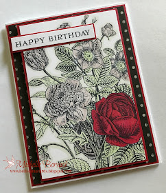
I created 3 red rose color splashed cards....
2 sympathy...
and 1 Happy Birthday.
For the sympathy cards I chose a very subtle print that looks like black linen fabric.
For the birthday card...I chose a distressed dot print.
I used an assortment of sentiments from different stamp sets

Before I share photos of the cards...
I have a confession to make.
The red rose was not my idea...
My crafty bestie said..."How about making one of the flowers red".
So...I gave it a try...(thinking...nah.... I'm not gonna like it)
Well...my bestie was on to something!
I loved it...
and I loved it enough to do a red color splash to 2 more cards!
So...thank YOU, Debbie, for the idea and inspiration!! 💗

This is the sympathy card...
The neutral tones are a very light green for the leaves..and a very light tan for the blooms
The LCI metallic card stock matting matches the color of the neutral blooms perfectly.
I felt like saying YIPPEE when I had a lightbulb-over-my-head-moment
and put them together.

and...here's the Birthday card....
For the neutrals I used the same light green...
But switched it up and used light grey for the blooms.
I love the red metallic matting ...
It adds a little spunk to this card, I think.
Each of the image pieces...for all 3 cards.... were matted with metallic card stock 
...then positioned with a large piece of fun foam for a nice sturdy lift.
My days of using small foam dimensionals
 under large image pieces are LONGGGGG gone...
I never liked that the image never felt solid.
(unless I used an entire pkg of those little dimensionals!)
I switched over to fun foam a long long time ago and am so glad that I did.
(I still use the little dimensionals for little things. )

The Wink of Stella on each rose WAS my idea 😉
(Not Debbie's...haha)
The red metallic card stock that I chose for matting 
adds a little bit of shimmer to the cards which is nice.


Color splashing this Botanical background image these past 2 days was really lots of fun.
I could have gone on and on and on creating more color splashed cards...
trying out different colors,
But...I had to remind myself that I still have other plans in mind for this fantastic stamp
and needed to move on to the next card that I had in mind....but hadn't created ....yet.

I hope that you visit again tomorrow to see what's next for this Botanical Background!
Have a great day!
and...
Thanks for visiting!
 Michelle.

Sunday, July 23, 2017

Brutus Monroe Botanical Background... Day 1...Version 1

I am going to make this blog post short and sweet...
because this fantastic stamp is the star of the show.
But...
I do have a few things to tell you before sharing today's card.

1. I saw this stamp on the Brutus Monroe web site and HAD to have it
2. I saw this stamp on the Brutus Monroe webs site and HAD to have it because I immediately had a head-ful of ideas as to what I wanted to do with it.
3. I got the stamp.
4. I tried each of my ideas.
5. I was so happy with the stamp...the ideas...the cards. Love at first sight.
6. I couldn't stop myself from using the stamp and creating cards. I just kept going.
7. I created too many cards for one blog post.

and so...
I will post one version of a card 
made with the wonderful Brutus Monroe Botanical Background stamp
each day....for a few days.

Today...
I have Version 1...

First ...I wanted to do a color splash look on a few cards.
(Color splashing is a term used primarily when editing photos....
where color is added to one element in a black and white photograph)
I'm doing something similar with today's cards...
The entire image is colored in subtle neutral tones
BUT...one bloom is colored with a different...more visible and vibrant color.

The dilemma arose in deciding which bloom to add color to.
(I liked all of them)
So...to start out...
I chose the beautiful petal-bound bloom towards the center of the image...
identical ...except for the sentiment.

I colored the image with Spectrum Noir (alcohol) markers.
Added some clear Wink of Stella to the color splashed bloom...
I chose a beautiful print to complement the coral-pink bloom
and some coral tone card stock for matting...

and this is what I wound up with...
a Happy Birthday card....
a Thinking of You card...
(and I left one card without a sentiment...so that it can be used for any...or all...occasions

This wonderful stamped image is all that I had hoped..and then some.
I love and appreciate the detail on each bloom and leaf....the size of the stamp...
and the crisp clear image that this detailed stamp gives.
I did have to crop the bottom a bit (approximately an inch)
to allow for matting and placement on an A2 card
No blooms were lost with cropping the image...just a few leaves.


I am SO thrilled with adding this gorgeous stamp to 
my (already too large) collection of botanical stamps.
It is such a beautiful stamp...
and left me feeling excited about all of the card making possibilities
that have yet to be.

Tomorrow...I'll be back to share another Botanical Background card.
Thanks for visiting today...
and I hope that you'll stop by tomorrow to see Version 2!
Michelle.

PS...
You can see Botanical Background HERE .... at the Brutus Monroe web site.

Saturday, July 22, 2017

A Die Cut Card with Dimension

Many years ago...
I enjoyed creating white on white cards.
The cards usually had lots of layers
some very basic die cutting..and lots of Cuttlebug embossing. 

It's been a long long time since I've done a white on white...
or ivory on ivory card
So I thought that I'd revive an old favorite of mine (with a little bit of a twist)
by adding a card stock layer for matting that had color
and by making a larger die cut the focal "image".

I have a favorite card stock that I use often...
Papertrey Ink's RUSTIC CREAM card stock.
It had little flecks in it that look like fibers and natural paper.
I knew that I wanted to use this card stock for this group of cards
I paired it up with a nice kraft colored card stock.
I chose a bird on a branch die... by IO (Impression Obsession)
and sentiments stamps from The Ton's SCRIPTY GREETINGS stamp set

I created 5 cards...3 sympathy...2 birthday...
I cut and prepped 5 mat layers with the kraft card stock...
 and 5 layers which Rustic card stock 
I die cut the 5 birds on the branch using the Rustic card stock. and set them aside.
I saved the larger card stock piece with the negative space
and stamped a sentiment on each one in a craft like ink color.
Next I positioned & adhered the negative space Rustic card stock over the kraft  card stock.
I applied foam dimensionals to the back of the birds...
and rolled glue dots to each of the leaves and some of the thicker branches
(***For info about using rolled glue dots go HERE for my HELPFUL HINT)
When I had all of the rolled glue dots and foam dimensionals in place...
I offset positioned the die cut piece over the negative space
allowing the kraft card stock to create the offset "shadow" & dimension.

Here's a close-up....so that you can see the details...
The die cut...offset...and "elevated" on the glue dots
and the flecks of natural looking fibers in the card stock.


I also created a few sympathy cards


I enjoyed creating this stack of 5 cards
by revisiting a card making style and color palette  that I have always loved..."tone on tone"
and I'm glad that this time...I included a mat layer with color.
(This now has me thing of other possibilities....
or as my friend Stone always likes to tease and say....
"Michelle is thinking...I see smoke coming from her noggin")

I'll put those ideas on hold for a little bit though...
because I've got some Brutus Monroe lined up for my blog for the next few days.

Thanks for visiting today, my crafty and creative friends...
Hope to see you tomorrow 
when I share the first day of a few days of Brutus Monroe 
here at my blog.
Michelle

Thursday, July 20, 2017

Seeing Pink...and Some Knobby Knees

I visited Scrap-a-Latte last week...
( a favorite small local stamp and scrap shop East of where we live, here on Long Island)
and picked up a sweet little Reverse Confetti flamingo stamp and die set called THINK PINK.
I'm kinda picky about flamingo stamps/images
and up until now...
I hadn't found a Flamingo set that caught my eye.
Until...I spotted this Reverse Confetti set
I was drawn to this set for a few reasons
The size of the flamingos...
and the 2 additional stamps that came with it.
and...
I LOVE THE FLAMINGO'S KNOBBY KNEES!!

I also picked up lots of other card making bodies...
(emphasis on LOTS)
including the great Summery Photoplay print paper 
that I also used when creating this card

I stamped and colored the images with Copic Markers
then cut them out with the companion die set.
I prepared enough of each image to create 4 cards.
Next...I cut out the Arched Stax pieces (Arched Stax Dies by MFT)
and brushed ink on each to add
I chose a light green LCI metallic card stock color
and a pink matte card stock color for matting & layering
I assembled the card using foam dimensionals and fun foam for added dimension.

And..
this is what I whipped up!
I opted to color the the largest center image to resemble a patch of ground...as opposed to using blue to resemble water....as I've seen done most time.
(The water is portrayed in the inked blue background)
When inking the arched die cut piece...
I made sure to add the yellow in the area where I knew that I would place the sun.
The flamingos and arched die cut were positioned what foam dimensionals and fun foam...
and rolled glue dots
so there's lots of dimension on this card.
HERE'S A HELPFUL TIP:
I always use rolled glue dots in place of foam dimensionals in small and tiny spots...
On this card...I used the rolled glue dots behind the flamingos feet...and behind there heads. 


I had so much fun creating this stack of 4 identical cards.
I'm happy with how the color came together...
The images were nice to color...
(I LOVE the center image...with the ground ...rocks and tall grass)
and yes..
I LOVE the flamingos and there knobby knees!

Thanks for visiting today, my crafty and creative friends...
Have a wonderful day!
Michelle.

Wednesday, July 19, 2017

A Magical Mermaid

I have an aversion to mermaids
ALL mermaids.
I am not a fan of mermaids..
especially images of adult mermaids.
I've avoided...by choie...the mermaid stamp rage
UNTIL...
now!

I was at a local scrap shop last week 
and saw Sunny Studio's MAGICAL MERMAIDS stamp set 
and i liked it.
So I purchased the stamp and die set.
I can hardly believe that I am saying that I like a mermaid.
(LET ME CLARIFY....That's not ALL mermaids...It's just the cuties in this set)

This stamp set has lots and lots of great imagesthat you can use to create a mermaid scene.
I stamped out lots of the images that I wanted to create about a half dozen cards with.
I purchased the dies...but because I had stamped and colored so many images...
I wanted to use my ScanNCut to expedite cutting them out.

Here's what happened...
UGH
NOT GOOD.
(The card stock with the colored images shifted while the blade was cutting..
UGH
(well...actually...I didn't say UGH....I said  %$*# and &%$@)

But..I had enough images colored and ready to go...
This time...I made sure they were secure on the cutting mat...
and had success with cutting the remaining images.

The images were all Copic colored..
I created a stenciled tiny fish print layer for the card front.
(ECHO PARK ~ BABY FISH STENCIL)
A friend had sent me some 8 1/2 x 11 sheets of beautiful water colored paper..
So...for the blue ocean background I die cut an oval water colored shape...
and used the same shape die in smaller size to cut a window in the stenciled piece.
I created my underwater scene...
positioning some of the die cut piece with foam dimensionals for added dimension.
I positioned the stenciled fish layer with fun foam
an then positioned the remaining pieces of the scene as shown (partially over the stenciled fish layer)
I wanted lots of dimension on the card

Finally...
I can say that I like a mermaid!
This set is sweet..and adorable...
and has lots of nice images that all work well together
along with some nice sentiments 
(I chose to not use a sentiment because I want this card to be useful for all occasions)

So...thumbs up to Sunny Studio for making a convert out of me!
A mermaid liking convert!

Thanks for visiting today...
Wishing you a wonderful Wednesday!
Michelle.

Tuesday, July 18, 2017

Brutus Monroe Botanical Background ...Day 3...Version 3

Hello crafty and creative friends!
Today I'm back with the third day of cards...
all created with Brutus Monroe's Botanical Background stamp.

Day 1 & 2 cards were all about "color splashing"
Dau 1...a beautiful pink bloom was splashed on the card
and yesterday...day 2...was all about a bold red rose bloom.

Today...I am sharing the same image...
with full on color.
I'm happy to share this card with you today
so that you can see the versatility of this stamp.
It;s a great stamp to color wash
(as i showed you yesterday and the day before)
and is also a great image to color as I've done with today's card.

I used Polychromos Pencils to color the image...
adding its of colors on the varied blooms of the image.
I chose a floral print 
and shimmery purple LCI metallic card stock for all of the matting layers.
The print matting layer is a very busy print..
but it worked well with this stamped and colored image
because only a small amount of the int is visible around the matted image layer.
(I'm actually very happy with the print layer and how it looks on this card)
As I always do what larger layers...
I used fun foam for a sturdy lift when positioning the image layer
I chose not to add a sentiment...which allows me to use the card for all occasions.

The large set of 150 Polychromos offered enough colors for me 
achieve the look that I wanted with this Botanical Background image.
I had plenty of colors to work with...blend..and create blooms that looked as I'd imagined them to be
when I first envisioned this card in my mind.

I'll be back tomorrow with one final look at another way to create cards with this fantastic stamp.
So..be sure to stop by tomorrow... to see what I've got up my sleeve next 
for Brutus Monroe's Botanical background!
Thanks for visiting!
Have a terrific Tuesday!
Michelle.
PS..If you missed the color splashed cards from Day 1 & Day 2......
take a look at my blog posts from yesterday....and the day before.


Be Sunny from the Inside Out

Hello my crafty and creative friends!

I don't mind creating cards that take a decent amount of time...
or cards that might be a bit labor intensive
The joy comes in the creative process and watching a project evolve.
However....
Sometimes...
 A nice quickie ...
Simple...CAS card
is a very nice thing.
and.
I just so happen tohave a stamp that is perfect for an easy quickie CAS card.

I've had Spellbinders BE SUNNY stamp (a Tammy Tutterow Design) 
for quite a while..
but have never inked it up.

I felt like coloring...
but didn't feel like starting a big coloring project.
and...
with that in mind...this stamp came to mind!

I wanted to keep the card very clean looking...
and I wanted the large image to be the focal point.
(I wasn't looking to add embellishments..bling...background color etc)

I got out my Colorista Markers (Crafter's Companion)
(They're alcohol markers..with a nice fine tip...perfect for coloring narrow and small areas)
I matched up some prints and metallic card stock for matting.
and this is what I came up with.
A pink version...
With a pink print and matting...
and some pink coloring.


and...
this yellow and orange version...
I enjoyed blending colors on both cards to shade the lettering...

I really love this saying...
(makes sense ...because I love quote stamps...)
I love the size of this sentiment...because it's ideal for an A2 card front.
and...
I love that the sentiment allows for some coloring...
as opposed to being ink only

So thumbs up to this Tammy Tutterow Spellbinders stamp...
It was fun and relaxing to just sit..and color...
and match up some prints and metallic card stock colors...
to create a few CAS cards.

Thanks for visiting today...
Have a great Tuesday!
Michelle.

Monday, July 17, 2017

A Set of Embossed Vellum Cards

HI everyone!
I've been busy creating cards with some new-to-me 
transparent colored Vellum.
by LCI PAPER

I am a true-blue CAS card maker...
and today's cards are very me...very CAS.

With the exception of the base card...
all of today's card stock and Vellum are by LCI...
I chose the Vellum colors that I wanted to use...
and chose embossing folders that seemed suited for the Vellum colors...
as well as the sentiments.
I then chose matting colors that complemented each Vellum color
as well as the sentiment chosen for each card.
*Sentiments are from a GREAT stamp set called...
SIMPLY SENTIMENTS... by Reverse Confetti
There was lots of coordinating going on with today's cards!

In the end...
I had 4 embossed vellum cards with an assortment of metallic card stock colors 
for layering and matting 
and
I used an an assortment of sentiments.

I've got a photo of each of the 4 cards to share with you today..
The Ebony vellum used on this first card is a heavier weight vellum
The weight of this Transparent Vellum is 54 lbs
When a light source is behind this 54 lb vellum...you can see the transparency nicely 

The next 3 cards were created with
GMUND COLORS TRANSPARENT/30 lb TRANSLUCENT VELLUM
...also great vellum to emboss.
Although its a lighter weight than the Ebony vellum above...
it held up to embossing nicely.

Because the 3o lb is more transparent
I chose to use LCI White Metallic cards stock behind the vellum..
(Had I used a color....it would have altered the look of the vellum color...
so I kept that first mat layer white/neutral
on each of the following cards

The PLACID BLUE from this collection of vellum is a really nice shade of blue...

The SCARLET RED vellum has a nice depth of color..
yet is still transparent.

and the last card..
created with LEAF GREEN vellum shows the embossing nicely, I think.

For me...being a card maker....
I was happy to find that Each of the 30 lb weight colors that I have tried
 are transparent enough to stamp behind...
allowing the stamping to show through.
And both  the 54 lb...and the 30 lb stood up nicely to embossing...
WITHOUT CRACKING!
That was s thrill for me...because often...I have found that vellum cracks when embossed.

SO...I can finally day that I have found a vellum that works well for me with stamping....matting...layering...die cutting...and embossing!
FINALLY!
All of this means that LCI TRANSPARENT COLORS VELLUM gets a BIG thumbs up for me
and will now take up residency in my studio!

Thanks for visiting today my crafty an creative friends!
Have a marvelous Monday!
Michelle.

Sunday, July 16, 2017

GIVEAWAY WINNERS!...and Gina K's Sentimental Summer

Hello my crafty and creative friends!
I've got lots to share with you today!
First...
The 3 GIVEAWAY WINNERS from last week's Catherine Scanlon Week
I did this the old fashioned way...
Each comment earned one entry..
each name for each comment was written on a slip of paper...
thrown into a hat (literally)
and the winners were chosen at random.

Here we go...


The WINNERS ARE (!!!!!)
AVRA WILLIAMS
 LINDA GORUN
 DENISE BRYANT

Congratulations to the Winners!
and thank you to each person who followed along and shared a comment
during Catherine Scanlon Week here at my blog.

WINNERS: PLEASE EMAIL YOUR FULL NAME (if different than your blogger name)
and MAILING INFO to me at: tobellissimacards@gmail.com
PRIOR TO WEDNESDAY...July 19th... of this week.


And now...on to some card making!!
YAY!! YAY!! and YAY!!

I finally had time to make a few cards with Gina K's
Sentimental Summer Stamp TV Kit.
The kit is terrific...
Lots of fantastic stamps......great card stock...and print paper...
and oodles of dies.

I've been doing lots of water coloring lately..
So I thought that I'd get out my Copics for a change of pace
and use them to create a few floral cards.

As the weather temps have been getting hotter here each day...
I've been thinking about Fall ...and everything that I LOVE about Autumn
(My favorite season)

So...my first card is...
a Thanksgiving card!

I used one of the floral stamps and 3 different leaf stamps & dies...
I stamped the images with Memento Tuxedo Black ink..
I Colored the images with Copic Markers..then die cut each one.
The Mini Scalloped rectangle is by MFT.
While the die cute rectangle was still in the die...
I used the die as a stencil..
and used Clarity Stencil brushes to blend 2 ink colors on the rectangle.
After the ink was brushed on and blended... 
I stamped the sentiment...which is by Impression Obsession.
I chose a background print from Gina K's Grateful Heart print paper pad.
I matted the print with LCI Gold Metallic Card Stock
The sentiment piece and flower were positioned with fun foam 
for a nice sturdy lift and added dimension.
(The leaves were not positioned with foam)
When the card was put together...
I added a little bit of sparkle to the flower with Clear Wink of Stella


You can see the dimension created with fun foam in this photo.

I created  a second card...
changed up the color palette ...
And...chose a great print paper that went nicely with the colored stamped image
This scalloped square is a Spellbinders die and this sentiment is also by Impression Obsession.
I used fun foam again for the square and flower...
and added a few crystal sequins .
I brushed the flower with Clear Wink of Stella

This Gina K Stamp TV kit is beyond lovely...
There are lots of stamps that I'm looking forward to creating cards with.
I'm so glad that I finally had some time to open up the kit...
and use this flower stamp for the 2 cards that I've shared with you today.

Thanks for stopping by my crafty and creative friends..
Have a wonderful Wednesday!
Michelle

Saturday, July 15, 2017

Transparent Vellum...A little Bit of Love...a Beautiful Print...and Some Die Cutting

If you visit my blog regularly
You'll recognize this bold purple print.
I created a group of cards a few days ago...
featuring a beautiful purple print...and LCI GMUND TRANSPARENT VELLUM

Today...I am using the LEAF GREEN Vellum, from the same paper collection,
and I'm combining it with the same beautiful print...
some glitter paper
a little bit of stamping..
and some die cutting.
This is the one of the cards that I shared a few days ago...


This Die....HEART FULL OF LOVE...by MFT
has 2 dies..
A solid heart...and the LOVE heart
I cut one of each...using LEAF GREEN vellum for the solid shaped heart
and purple glitter paper for the one piece love outline heart.
Once both pieces were die cut..I used liquid adhesive 
around the edges and behind  LOVE to put them together..
Next...I used the same liquid adhesive all around the back edges of the layered heart piece
and positioned it on the card front.
I stamped the words..
matted them with the green velum... positioned them with foam dimensionals.

And wha-la!
A card!

I've been trying the LCI GMUND  TRANSPARENT  Vellum for a few days now
and so far...the velum worked well with each of my card making ideas.

I've always found it a challenge to find velum...in clear...or colors...
that I liked..
I think that problem may now be resolved!
Next up...I'm going to give embossing a try with the LCI Vellum..
I have a CAS card in mind...
and am hoping that this vellum holds up well to embossing.

 I'll be giving the embossing  a try in a day or two...
so be sure to stop back to see how the embossing turns out!

Have a great day, my crafty and creative friends!
Michelle!