Pages

Wednesday, August 31, 2016

It's Wednesday!...Crafter's Companion Inspiration Design Team Project Day!

It's Wednesday...
and that means that it's Crafter's Companion Inspiration Design Team Project Day
here at my blog.

Today I've got a beautiful crisp looking CAS (*Clean And Simple) card to share with you!

Sheena Douglass' A Little Bit Sketchy ~ Poppies and Daisies stamp set
and 
Stamp-it Travel Script
 are the stars of the show!

I stamped the Travel Script image to create a background using a light grey ink...
and then...
stamped the Poppy Image offset to one side and partially over the script with black ink.

The poppy blooms were colored using Spectrum Noir (Alcohol) markers
to create a rich red shaded tone.
(A great contrast against a crisp white lightly stamped background, I think)

The image layer was embellished with sheer shimmery ribbon
and was then matted on Candy Red Shimmering Card Stock.
A perfect match for the bold color of the poppies.
(Don't you agree?)


This stamp creates a beautiful card....
and the travel Script stamp is ideal for the background.
Using Spectrum Noir Marker IG1 created the perfect faint shadowing around the floral image
giving it a little bit of a "pop"!


I am truly a CAS card maker...
and both of these stamps allowed me to create a card that defines what CAS is all about...
and...
 shines a spotlight 
on a beautiful...striking...
floral image.

Thanks for visiting...
I hope that this card has inspired you...
and has you thinking about crating a CAS card of your own!
Have a wonderful day, my crafty and creative friends!
Michelle.

Supply List:
                     Shimmering Cardstock - Candy Red
Coloring: Spectrum Noir Markers : TN4, TN3, CG3, CG4, DR2, DR3, CR6, CR8, CR9, CR11, IG1
Other: Trimmer, Ink pads, adhesive, ribbon


Sunday, August 28, 2016

2 Quickie Cards

I had stamped some yellow roses using Altenew's Layered Stamp set: Vintage Roses
on a sheet of 8 1/2 x 11 card stock a few weeks ago...
I created a few cards
and had 1/2 of the sheet left...
So...
I took a few minutes to create 2 simple CAS cards
using the yellow roses and Altenew's Halftone Happy Stamp Set

For the first card....
I stamped the Halftone solid image "HAPPY" on vellum 
along with the word birthday with Versamark...
then heat embossed with Sparkle n Sprinkle Fine Detail Gold Embossing Powder.

I have to say...
When I first got the stamp set...I didn't like the upper edge of the "H"
because it has a pixilated look.
BUT...after I used it once..I immediately changed my mind...
and since then...it had become a stamp set that I reach for often.
I love the size and styles of the main images in this stamp set
(one is solid and one is lined)
and when heat bossed...the "pixilated" Happy adds some texture to the card.
After I embossed the sentiment words... 
I chose a mat color..and a base card...
and wha-la...a quick little card
(Thanks to the fact that I had stamped out a full sheet of card stock with the roses...
enough to give me 4 cards, if cutting the roses to cover most of the card front...
or 
 you could create more cards ...if you choose to cut the sheet into smaller pieces)


For the second card...
using the last piece of the yellow Vintage Roses...
I used the same stamp set...but chose the lined "Happy" this time.
Again...I stamped with Versamark...
but this time..I stamped directly onto the roses...
in hopes that the lined image would look nice with the roses peeking through the word "Happy".
I double matted the roses this time...first on cream...and then on yellow...
and...
1-2-3...
I had a card.


When it comes to card making....
I have lots of patience...
so creating a card that takes some extra time never overwhelms me...
BUT...
I also love making cards that come together easily...
and don't require me to have a thousand different supplies and tools all over the work table.

Both of these cards were quick...easy cards.
mainly because I had stamped the roses out a while ago...

This brings me to realize that every so often...
I am going to stamp out a sheet ...or 2 ...or 10....
of some favorite layered stamped images...
and, I'll set them aside...
knowing that they're there....
for the times when I just feel like making a few quick and easy cards.

I hope that you're inspired to do the same...
Have a wonderful day, my crafty and creative friends...
Thanks for visiting!
Michelle 

Thursday, August 25, 2016

Casual Coloring...Outside of the Lines

Oh boy...
this was a BIG step for me..
Yes...ME....neat tidy obsessive CAS card maker Felix Unger ME!

I colored OUTSIDE OF THE LINES....
a little bit...
on purpose!
But just a little bit.
Eeek
Scary stuff for me.

(Excuse me while I leave now to find a therapist who can talk me off of the CAS ledge
and tell me that coloring out of the lines is okay)

OMGosh...
Holy Carumba...
I'm not sure if the experience was "freeing"...
or has suffocated me...
But...I did it!

Here's the back-story about how this card came to be...
and
Here's how the lunacy began...
Last week I was browsing around on line at a web site for organic products 
and saw an ad that had some BIG beautiful sketch-like flowers all around the border..
and off of the edge of the ad page
They were colored..with what looked like markers...
on brown paper...and some (not all) of the coloring was out of the lines...
The largest of the flowers (there were 2)
 were outlined in a shimmery thick back line that was NOT neat...
NOT tidy...
NOT even outlined over the flower lines...
the outlining was a little bit willy nilly.

That ad caught my eye...
The flowers caught my eye
The style of "coloring" caught my eye
and the flowers reminded me of the floral design style of one of my favorite stamp design artists..
Catherine Scanlon.

I've been busy with some other card projects this past week...
but all of the while...on and off...
I was thinking of those flowers in that ad...
So...
 as soon as I had a moment...
I got out the Catherine Scanlon "Sunshine" stamp that I was reminded of
when looking at the on line ad.

I got out the rest of the supplies that I had been thinking I'd use
when I eventually got to doing my own take on that ad that had inspired me.

I stamped the large floral image on to kraft card stock...
colored it with markers...
then outlined, partially, with a Krylon Gold Paint marker.
(The ad used thick black lines for outlining....I felt that was a bit "heavy" looking...so I chose gold))

Yes...
for neat-nik me...
it was difficult to not be neat and tidy.
But...
I DID IT!
(I'm not sure that I'll do it again...but I did it...this time!)

Here's the not-so -tidy result


I think that this close-up shows more of the casual
out-of-the-lines coloring and detailing.
I love the image
(I am a huge Catherine Scanlon fan...as some of you already know)
I love the coloring on Kraft card stock
I love the colors and the pop of bright pink in the image....as well as the mat layer
but....
I still hyperventilate when it comes to the gold outlining
(I'm being dramatic...I'm not REALLY hyperventilating)
But the truth is...
this large flower is a farrrrr cry from my usual coloring style.
Still..I'm glad that I was inspired by that ad
(wish I had saved it)
and...
I'm glad that I took that inspiration and ran with it.

So ..
what do YOU think this style of coloring?

Thanks for visiting....
and..
I hope that you leave here feeling inspired to give something that's out of YOUR ordinary a try!
Michelle

Wednesday, August 24, 2016

It's Wednesday!...and it's Crafter's Companion Inspiration Design Team Project Day!

It's Wednesday!
and...
That means that it's Crafter's Companion Inspiration Design Team day, 
here at my blog!

My DT project this week is a cheerful little card...
created with an adorable Moonbeam Meadow image!


I got out Moonbeam Meadow's "Love Birds" stamp set...
 a Memento Tuxedo Black Ink Pad...
Spectrum Noir (Alcohol) markers...
Some Shimmering Card Stock...a strip of vellum...
and I created a few enamel like dots...
and wha-la!
I had n sweet little card! 

 This "Love Birds" image has so many great details...
perfect for some Spectrum Noir (Alcohol) Marker coloring!
I chose to use a limited color palette..
inclusive primarily of greens and yellows
with small amounts of orange and blue
and some neutral colors for the tree trunk.
I kept the matting simple...and coordinated it with the colored image..
using Black Pearl Shimmering card Stock
and...
Forest Green Shimmering Card Stock
on a basic white card base.


I stamped the sentiment on a strip of vellum paper
and wrapped it around and tucked it under the Black Pearl mat layer  
before adhering it to the Forest Green mat layer.
I jazzed up the vellum strip with a few scattered enamel-like Nuvo Drops.


I liked this stamp set when I set out to use it for the first time...
to create this card.
But...
When the card was finished.....
I no longer "liked " it...
Instead...
I LOVED it!


and...
I hope that you now find yourself loving this sweet little Moonbeam Meadow image too!

Have a wonderful day...
and thanks for visiting!
Michelle.

Supply List:

                   Shimmering Cardstock - Forest Green
                   Vellum Paper
Coloring: Spectrum Noir (Alcohol) Markers in the following colors: LG2, LG3, LG4, FS4, FS5, TN4, IG2, IB1, GT1, GT2, BGR1, GT3, BT7, CT1, CT2, LY1, OR1, OR2, CR7, Colorless Blender
misc: Trimmer, adhesives, Nuvo Drops, Memento Tuxedo Black Ink pad,


Tuesday, August 23, 2016

The Last of the Layered Purple Roses....for a while

I had one last piece of card stock left...
from the 8 1/2 x 11 sheet of layered purple roses that I created the other day....
and thought that I'd put together a fast card with the remaining piece.
(*The roses were stamped with Altenew's Vintage Flowers stamp set)

I heat embossed a Happy Birthday sentiment on a strip of vellum...
chose a deep purple metallic card stock color for a mat layer...
scored a card...
put it all together...
and wha-la...
a birthday card!

The gold embossing on the vellum is always beautiful, I think...
and the vellum is great for the sentiment...because it doesn't hide the beautiful roses.


I've enjoyed creating cards with this layering stamp set...
(*Altenew has many of them...)
The best part was creating the 8 1/2 x 11 sheet of flowers?
Having it ready to go
and then being able to create 4 cards with the cut-to-size pieces that are perfect for card making!


I've got a small piece  of a yellow layered/stamped floral on hand from a prior project...
and am thinking that I'll create a card with that as well...
You've seen lots of purple from me lately...
yellow will be a nice change of pace!

Thanks for visiting today....
have a wonderful...and creative day, my crafty pals!
Michelle.


Monday, August 22, 2016

Pencil Coloring on Kraft Card Stock

In my last blog post, I mentioned that I hadn't colored with pencils in a long time...
and that creating a pencil colored card was on my crafty to-do list.

I have quite a few bird stamps...
and felt like coloring a bird...
I went through my bird stamps...
and chose a stamp set called A New Day...by WPLUS9... to work with...
a stamp set that I've enjoyed using before.

I stamped the image on to Paper Trey Ink Kraft Card Stock...
and colored it with Spectrum Noir Blendable Pencils
(I love coloring on Kraft card stock)

Actually...
My first thought was to color the image with my Prismacolor Pencils...
but then I realized that I haven't seen them since the entire house was packed up
for our hurricane construction..
and...since I moved into the new studio.
(Makes me wonder where the heck they could be(??) )
Where does a big tin of 120 pencils disappear to?
Oh well...
they'll show up.

PTI Kraft card stock is my favorite Kraft card stock...
it's nice and hefty....
 It's a nice color...
and the thing that I love bet about it is that
 it has little flecks of what looks like fibers,  in it.
I used a nice muted print from a DCWV paper pad for the mat
(I chose something with green tones...to pick up the colors of the leaves)
The Spectrum pencils blend nicely...
and it's easy to layer colors, as well.

The shading ...and the fiber-like flecks in the card stock
are easier to see in this close-up...
I really like this image...
and I especially like that the bird..the branch...leaves and berries are all one stamp...
Some of my other bird stamps have multiple stamps that can be used to create a branch...leaves...flowers etc
But this WPlus9 set is just one stamp..
which is nice.
The sentiment is from a Stampin UP stamp set called Best Birds
Yes!...another bird set!

In the past...
I've heat embossed this image with gold embossing powder...
and then water colored it.
(Also a great look for this image....and very different than this pencil colored look)

Every time I color with pencils on Kraft card stock...
I am reminded of how much I like this look.
I actually like it so much...
that I have already pulled out a Catherine Scanlon Designs stamp 
to create another  card by coloring on kraft card stock 

I'll share that card here in a day or two...

Wishing you a wonderful day...
and thanks a bunch for visiting!
Michelle.

Sunday, August 21, 2016

A Beautiful Quote..... 2 Ways

I'm still enjoying "playing" with my Clarity brushes...
and am so happy with how they allow me to blend, build and layer color.
I've been experimenting with color combos and color density......
and so not all of the "pieces" have been card worthy...
Still...they've allowed me to get a great feel of what the brushes are able to do.

I had a small piece of purple card stock that I had "brushed" 
and...I thought  that it would be nice to use on a card.
I also had a beautiful quote stamp by Impression Obsession 
that I have been wanting to use...and an 8 1/2 x 11 piece of card stock that I had filled with beautiful Altenew purple roses created with the Vintage Flowers stamp set.
So I put it all  together and this is what I wound up with...

The quote was double stamped onto the "brushed" cards tock with black ink and a gold shadow
and was then matted on a beautiful deep purple metallic card stock.
Then I matted that layer onto a piece of velum.
I gathered up some fine gold thread to create a small nest-like circle 
that I placed behind the upper left of the quote.
I then used low profile dimensionals behind the velum ...
and positioned the complete piece of layers over the rose layer to complete the card.
You can see all of those details in the photo below...
the border of the roses peeking out from behind the quote...
the gold thread...
the metallic mat layer...
as well as the narrow mat layer of vellum.

This quote is so lovely...
So lovely as a mater of a fact...
that I wound up creating a second card with it...
as soon as I finished this one.
(and...I'm thinking that it would be a great quote for a graduation card)

and now...
...on to the second card we go...

The materials and supplies are the same as the card above...
with a switch to using green metallic card stock as the mat layer
I used the purple roses again as the background......
but this time..
I stamped the quote onto a wide piece of velum.
(Wide...but not equally as wide as the rose layer)

Once the quote dried 
(it takes a bit of time for ink to dry on velum)
I cut the velum longer than the rose piece
 so that I would have enough to fold over and under at the top and bottom...
and to secure firmly behind the rose layer
with ATG adhesive.


As you know...
I try very hard to NOT choose favorites when creating cards
and...
IF I DO have a favorite...
I rarely reveal which it is...
BUT..
today..
I am going to put myself out there and admit..
I DO have a favorite when it comes to these two cards...
and it's THIS card.
That's not to say that I'm not okay with the first card (above)
BUT..
there's just something about THIS one (below)
that I am liking a little bit more.
I actually like that the beautiful roses are more visible in this version...
and I love that the quote is stamped on velum.


I've been enjoying having time to experiment and "play" around with some of my layering stamps.
It's really lots of fun to watch the flowers emerge as I've added each layer of color...
and I've found that stamping out an entire 8 1'2 x 11 sheet works well for me
being that I almost always create in multiples.
It's also nice to create a full sheet of a design...
and have it on hand for a day when I feel like creating a few cards
(which is everyday!)
but might not feel like "starting from scratch" 

I've been doing lots "inking" lately..
creating cards with layered stamping ...
and creating backgrounds with the Clarity brushes...
and I've enjoyed all of it.

What I haven't been doing much of is...
pencil and/or regular marker coloring.
So I am thinking that maybe that's what will be next on my card-making-agenda!

Have a wonderful Sunday, my crafty and creative friends...
and thanks for visiting!
Michelle.


Wednesday, August 17, 2016

It's Wednesday and that means that it's Crafter's Companion Inspiration Design Team Day!

It's Wednesday (again!)
and that means that I've got another Crafter's Companion Inspiration Design Team Project for you!

I love to water color...
and I am a big fan of Sheena Douglass stamps & images...
and I've got a card this week that allows me to enjoy both!

I chose Sheena's A Little Bit Sketchy ~ Climatis for today's card.
The large card front sized image was colored with Spectrum Noir AquaBlend Pencils.
When the image was complete...
I used Shimmering card stock for multiple matting layers.
The base card was created using Spectrum Noir Ultra Smooth Cardstock.
The sentiment is one of many stamps included in the
Sara Signature Collection Love and Romance "HELLO" stamp set.
I handcut a small banner for the sentiment.


It's easy and fun to layer and blend colors with the AquaBlend Pencils
This image has lots of shading and blending...
The flowers...leaves...and the torn paper  show this nicely.
The background, behind the flowers also shows color bending nicely..with a mix of yellows and greens blended together..


Here's a close-up where you can see the color blending...
and the sentiment banner


Once again...Sheena Douglass brings us wonderful images to create cards with.
I chose to water color this image ...
but I am thinking that Spectrum Noir (Alcohol) Markers would also work beautifully.

Thanks for visiting...
I hope that my Inspiration Design Team Project that I've shared here 
 inspires you to create a beautiful card of your own...today!
Michelle.

Supply List:

                    Spectrum Aqua Watercolor Card Stock
                    Shimmering card Stock ~ Black Pearl
                    Shimmering Card Stock~ Green Envy
Misc: Trimmer, scissors, adhesives, foam dimensionals, paint brushes, water receptacle
Coloring: Photo(s) below of the Spectrum Noir AquaBlend Pencil colors used:


Tuesday, August 16, 2016

The "Other" Purple Thank You Card

Yesterday...
I shared purple Thank You card #1...
with  step by step photo tutorial.
And...
Today...I'm sharing the "other" purple Thank You card.

yesterday's card was a bit more involved..
not difficult..
just more involved..
because it had multiple steps and techniques.

Today's card is much less involved...
kinda straight forward...
and...
it's very very CAS (Clean And Simple)
(My preferred style of card making)

 Like the first purple Thank You card...
I knew..with this card...
exactly what I wanted to "do".
and..
it focused on a great little Concord & 9th Stamp set called Painted Thank You
The little flowers and leaves included in this stamp set are great...
an the sentiment is fantastic.
I needed to create 3 of this card.
It was lots of fun to create and I love how crisp and clean it looks
with the dark purple flowers and a splash of green against the white background.
That's right up my alley! 
It was fun picking and choosing which stamp to place where...
and how and where to stamp the leaves and dots.
As I stamped each page..
I was able to see the card coming together...


I chose a white card base...
and a purple metallic card stock for matting.
The purple mat is an ideal companion to this card front...
The little green leaves and the dot trio stamp 
add just the right amount  color to brighten this card up.


I LOVE LOVE LOVE the ThankYou sentiment which is the main image in this stamp set.
I love it's casual brush stroke style...
I love the size of this stamp
(perfect for an A2 card front)
and I LOVE how it looks when heat embossed.


I really enjoyed creating multiples of this card...
It was a fun...non-complex card to create...
and I had the opportunity to use a stamp set that I had never used before.
and...
I am still thinking of how much I really love the Thank You sentiment stamp.
This stamp set gets a definite thumbs up from me..
I foresee myself using the flowers, leaves and dot trio 
with....and without the sentiment
in the future.

As always.
Thanks for visiting...
and as always...
I hope that you've been inspired to dedicate some time today to a little bit of creativity.
Michelle.

Monday, August 15, 2016

A Step by Step Tutorial ~ Creating a Stamped and Heat Embossed Thank You Card

I was asked to create 6 thank you cards...
my choice...
my design...
total creative freedom for me..
But...
there was one request...
they needed to be purple.

I immediately had a few card sketches bouncing around in my head...
I knew which stamps I wanted to use...
and...which inks...
which tools and techniques etc.
There was no pondering...or hesitation...I knew exactly what I wanted to do!

So I got to work right away...
creating both card designs.

I'll be sharing one of the cards here day...
along with step by step instructions accompanying  each photo.

Whenever I create a card I always get all of my tools and supplies out prior to getting started.
This is helpful to me...because I always create multiples of a card design.
If someone requests a particular card design...
I create what they've asked for...plus a few extras...
for my ETSY shop....
or to keep on hand for when we (my family and I) personally need to send a card.

So...keeping the idea for each card in mind..
I gathered everything up...
and got started!
(this is when having an organized studio 
where everything has a place and is labelled....comes in handy.)

For the first card....
I created a background of purple and green with my Clarity brushes and Altenew Crisp Ink.
I chose to keep the color application in the subtle zone...
because I knew that I would be stamping over it.


 I used Altenew's Dahlia Blossoms layering stamp set to create the floral background.  
This is the first "layer" of the flowers...stamped in the lightest of the purple ink colors

Here the background paper is starting to come together...
The flowers are complete with 2 layers of purple ink
and I had begun to stamp the leaves ...
which were done in 3 steps...with 2 colors of green ink


When the background stamping was complete....
I cut the 8/12 x 11 sheet of stamped card stock into 4 identically sized pieces.....ready for matting.


I chose the mat color....purple metallic card stock...
and cut 4 identical mats.
I also cut 4 strips of vellum paper...
and used Versamark ink to stamp the Thank You sentiment ..
from the Hero Arts stamp set
(Sorry...can't remember the name of this stamp set).
I heat embossed the 4 sentiments on the vellum strip 
with Sparkle N Sprinkle fine detail gold embossing powder.


I positioned each strip over the stamped piece of card stock
and adhered it by placing tiny dabs of clear liquid adhesive with a precision tip applicator...
behind the embossed sentiment.
Once the vellum sentiment strip was in position...
I used ATG adhesive to secure the vellum on the back of the stamped card stock.
I applied ATG adhesive to the back of the stamped piece....
and 
I then positioned it on the purple metallic mat.


Then I got out 4 white base cards 
created from Papertrey Ink's White card stock....
my Scor-Pal and a bone folder.
*Note: I keep approx 200 pre-cut white card bases 
and 200 cream colored pre-cut card bases on hand at all times.
When I am creating a card...I just have to score and crease...
and wha-la...
a card!

Here's the completed card.
It turned out EXACTLY as I had envisioned it in my mind....
which in this case...
is a good thing!


Pretty...
isn't it?
and...
kinda neat to know that just a short time before this photo was taken...
I had started out with a sheet of plain white card stock.


I'm happy to share this step by step tutorial with you today
in hopes that you've been inspired to create a few cards of your own..
and that you feel confident in knowing that creating in multiples is something that's do-able!

Thanks for visiting...
and don't forget to visit again tomorrow...
when I'll share the second purple thank you card 
here at my blog.

Wishing you a great ...crafty...and creative day!
Michelle.

Saturday, August 13, 2016

A Busy Friday Night

My Friday night was a busy one....
and...
it was the kind of busy that I like!

A friend asked me to make 15 water colored cards for him...
5 each...of 3 different designs.
He asked that the hydrangeas be a coral/red/pink color...
the other images could be water colored in colors of my choice.
So I did all of the stamping and heat embossing the other night
and did the water coloring tonight.

I anticipated putting the cards together on the third night...
but I had the air conditioning in the studio turned up to icicle temps..
and so...the water colored pieces dried ASAP
which meant that I was able to complete all 15 cards ASAP!!

I didn't plan on doing a blog post about these cards...
but as I was working on them the colors all looked so pretty....
and so...
I changed my mind about the blog post...
took a few quick unplanned photos with my phone...
and decided to share them here at my blog.

 Here they are...right after I matted all of the water colored and dried images...
The colors are so pretty...
That's what really made me decide to share them here at my blog...
(I know...I know....I am repeating myself about the colors)
Each image was heat embossed with gold embossing powder
and then water colored with 
an assortment of ink pads..
Kuretake Gansai dry paints...
and..
ZIG markers


After the images dried..
I took a sec to get out some metallic card stock...and choose the mat colors for each image.
I matched each painted image to a metallic card stock color that complemented the image.
I then matted all of the images (*as seen above)

If you visit my blog now and then...
you've seen me create cards with this image many times before...
I'm asked to create "Hydrangea cards" often...
which is fine with me...because I like this image...
and I love to water color.
This is a Stampin Up stamp set called "Best Thoughts"...
and I have put a lot of mileage on my hydrangea stamp.
I know that it's a nice stamp set...
but truthfully...I never imagined that I'd get so many requests to create cards with this image.


The next 5 cards were created with a large 6x6 stamp called Peony Garden....
from The Ton Stamps
I used Ultra High Gold Embossing powder for this card.
I love how the Ultra High EP adds some great texture to the image.
Ultra High EP isn't for everything...every image...
but....this image is ideal for Ultra High Heat Embossing, I think.
Again...if you visit my blog often...
you've seen me create this card before..in different colors...
and always with the Ultra High embossing power.

And finally...
5 of this wonderful Catherine Scanlon Stamp...
I am a HUGE fan of her stamp designs...
& always welcome the opportunity to sit down to create some cards with a Catherine Scanlon stamp.
I've made cards with this stamp in the past...quite a few times...
I've heat embossed this image with black embossing powder...
and Ive heat embossed the image with Gold embossing powder...
I prefer the gold for this particular image.
This is always a fun image to paint...
there's lots of opportunity to add color.


I surprised myself by completing all 15 cards ...
because the original plan was..
stamp and emboss one night...
water color the second night...
mat and put together the cards ...the third night.

Finishing the cards sooner than I thought that I might is a good thing...
because I've got my eye on another Catherine Scanlon stamp that I haven't used yet...
one that is fantastic for water coloring.
Now...
With the 15 cards finished....
I can ink-up that new Catherine Scanlon stamp a day sooner!!

Thanks for visiting...
have a wonderful Saturday, my crafty friends!
Michelle


Friday, August 12, 2016

What IF...

I have always functioned with a significant degree of "What if" curiosity in my life.
I am inquisitive by nature...
I love to learn new things...
I am very hands-on...
and I'm always interested in the "how" &  "why" about things.
My Mother always liked to recall that as a child...
I was more interested in how a toy worked...
than I was in actually playing with it.
A broken clock..watch...or radio was always something that excited me
because I could open it up...and see how it worked.
(So you can imagine how happy I was when at toddler age...
my daughter seemed to be a mini-me...
demonstrating the same curiosity...
and always eager to explore the "what ifs".

Well...
guess what?
A 5 year old still exists within me...
and extends into my "adult"card making and paper crafting life!

So....
a while back...
I wanted to see what could be achieved by using an alcohol based marker...
on water color paper.
What if....I colored an image with alcohol markers...
but the card stock was water color card stock...
not the usual  blending friendly Ultra Smooth card stock 
that I always use when coloring with alcohol based markers

So...
I stamped an image out...
heat embossed it with gold EP..
and got out my Spectrum Noir Alcohol markers....
and gave it a try.
(sorry...I have no clue who makes this bird stamp)

Well..
here it is...
I actually like the "look"
I like how the color gravitated to the outer edges of the image...
forming a darker outline of color.
I should note...there is no such thing as "blending"an alcohol marker on water color card stock....
because..
the water color card stock acts almost like a wick...
It pulls the ink and absorbs it like a sponge....
and the ink cannot be moved, to be blended, on this card stock
because of the wick-like characteristics of the card stock.
This being said..
I want to note...
I won't be doing this again
because I foresee the ink being sucked out of my alcohol markers in a flash...
which would be such waste of ink.

Still..I'm glad that I wondered "what if"..
and gave this a try...
and I
am happy to share the result with you here...
in case you, too, have ever wondered...
"what if"....

And..
the bonus is...
the end product was actually "pretty" enough to be used to create a card!
(I actually had set this colored image aside quite a while ago...
never thought of making a card with it...
and just now looked at it..thought that it was pretty...
and decided that it was card worthy...
so I created this CAS card with it.


Here's one more photo...
so you can see the detail a little bit better...
(up close and personal )
I aded a little bit of gold twine..
and matted the image on a beautiful dark blue shimmery, glistening metallic card stock


So my little "What if" experiment had 2 results...
#1. I clearly saw that the water color card stock acted like a thirsty wick..
and sucked up lots of the alcohol ink from my markers.
(NOT a good thing)
and
#2. The application of alcohol ink allowed me to create
 a colored image
that is not only lovely...
but it was card-worthy as well.
(so...I guess that all was not lost)

Thanks for visiting...
Have a wonderful and creative day my crafty friends....
and may you always be bold and daring...
and inquisitive enough to pursue your own "what ifs"...
because if you're like me...
you'll be happy that you did....
if for no other reason other than...
you walked away having learned something.
and maybe..
you'll wind up with a nice card as well!
Michelle


Thursday, August 11, 2016

Clarity Brushes: Flawless Color Blending

Hallelujah!
Finally!
Flawless color blending is a real life possibility!!

WOW!

I finally had some time break out my new Clarity brushes!
They've been sitting on the worktable in the studio for more than a week...
Finally.....I had a chance to give them a try!

I started out with some apprehension...
Decades of card making...
and all sorts of (failed) blending tools later...
I (think) that I have finally found something that makes great blending a cinch.
Wowzer!

I needed to create a few sympathy cards...
and thought that I'd put the brushes to work for the first time.
A true test...being that flawless blending of darker colors can sometimes be a challenge.
I was going to use a few purple ink..and a dark blue...

And guess what!!?
The Clarity brushes did not disappoint!

Wanna see?

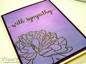
Card #1
First try with the brushes...
I was able to build the color(s) with multiple strokes of the brush...
and..
adding different colors to the card stock was a breeze.


To create the card I double stamped the flower and sentiment
from the very beautiful Large Peony 2 stamp set by The Ton Stamps using my MISTI.
I positioned the stamps...
and stamped once with gold ink..
left the stamps in position in the MISTI...
cleaned the stamps
moved the card front a tiny bit on the MISTI platform
re-inked the stamps with black ink
and stamped again.
Doing this gives a golden glow around the black lines of the image and the sentiment.
I finished the card with a few drops of clear drying Morning Dew Nuvo Drops
(Love Love Love Nuvo Drops...all of the colors are fantastic..and Morning Dew is awesome!)


I had such fun using the Clarity brushes..
I decided to give them a second try...
again...with the same ink assortment...
and again...to create a sympathy card.
This time...I did something a little bit different.
I highlighted the area where the large flower was stamped by adding a deep pink ink
You can see the gold and black double stamping a bit better in this photo..
especially where the sentiment is stamped.
The sentiment almost looks like the camera moved when the photo was taken...
See the gold shadow?
That's the double stamping.


Applying and layering the ink was a breeze...
I hesitated a bit before adding the deep bright pink ink to the flower area...
but thought..
Go for it!...If it looks bad...trash it...it's just a piece of card stock ...no biggie
so..
I went for it...
and I'm glad that I did...
because it allowed me to see the possibilities that exist when using Clarity brushes.

I bought 2 sets of the brushes...
and plan on designating one for each color family...
that plan should keep my brushes working nicely...and eliminate transfer of residual color when changing to an ink out of a color family.

My final thought?
Clarity!!!
Where have you been for decades of my stamping and card making life!!
Holy moly!
I can hardly wait to get rid of the oodles of sponges and other blending tools
that I have bought over the years......
tried..
disliked...
been frustrated with...
ruined a card with...
and never used a second time.

Adios miscellaneous blending tools...
Clarity brushes are in the studio now!

If you've been thinking of getting a set or two of these wonderful brushes...
don't hesitate...
They're easy to find on line...
(I ordered mine for an awesome price......at Mollys Square
I just checked the website...and she still has them in stock)

Have a great day my crafty friends...
Now...leave me a comment below telling me how excited you are...
because you're off to order yourself a set or 2 of these awesome brushes!
Michelle.